Onboarding
Themes
Workflow Architecture, User Experience, User Interface
Team
Principal Product Designer
Head of Product
Sr. UX Writer
Clinical Content Lead
Engineering Lead
Freelance Video Studio
Tools
Goal
Increase user engagement and improve clinical outcomes through a better understanding of the therapeutic.
Project Approach
Many of our patients who entered treatment were unsure of what was being asked of them and what the treatment entailed.
To mitigate this, Better had previously made incremental improvements to its onboarding. Yet they primarily focused on creating more descriptive content explaining the therapy and terminology. This made for an onboarding flow that, at one point, peaked at 115 screens. Most of these were read-only, with front-loaded introductory videos that were many years out of date.
I was tasked with improving this early experience in order to increase user engagement, through which we hoped to see better clinical outcomes.
Research Research Research
Initially, our Onboarding experience was broken across two different experiences, colloquially called Onboarding and First Time User Experience (FTUX).
Partnering with our Lead Data Scientist, we dug into the data and saw that many users were “getting stuck” in FTUX. Simply put, many users were abandoning the app before getting to treatment. While we had many hypotheses about why this was, interviews with patients—from scripts I wrote, performed by the patient services team—revealed two core beliefs preventing patient progress:
Users were exhausted by the amount of work we were asking them to do before getting to use the product
Users believed they were already in treatment, and did not proceed because the product did not guide them to the next step
We also saw that, post-FTUX, users were not meeting the key metrics for measuring success of the therapy, threatening its viability as a product.
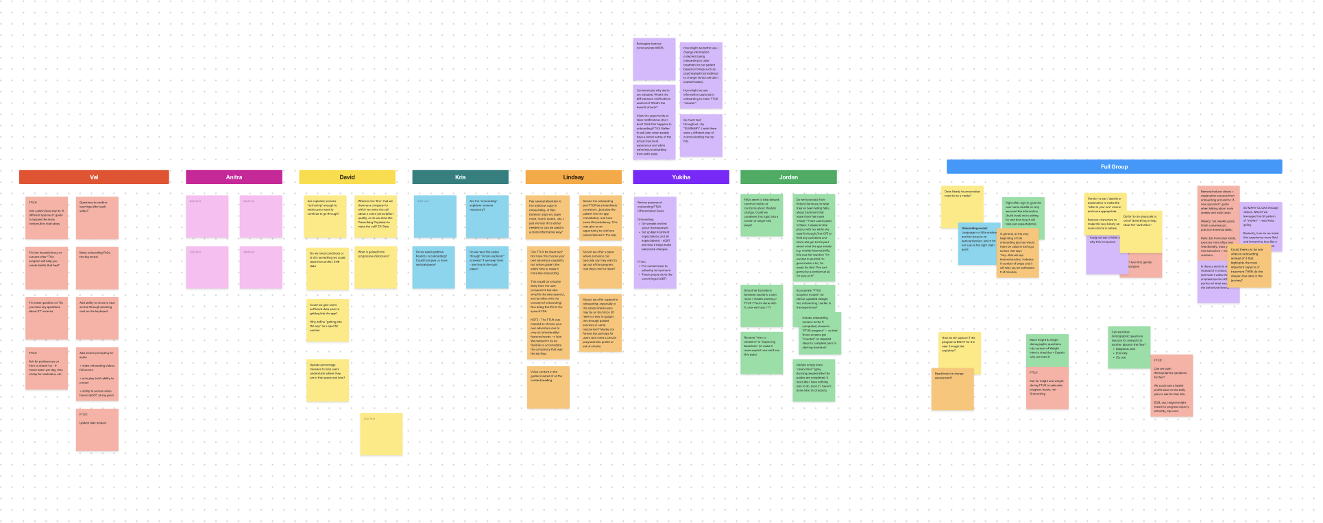
I took these findings and led internal brainstorming sessions to help us identify gaps and potential avenues for exploration, as well as to ground the team on what an effective onboarding needed to do for us.
Prototypes
Content is core to our treatment. However, I hypothesized that such an extensive onboarding flow with such high cognitive load was likely causing user burnout. I theorized that so much reading meant users couldn’t absorb necessary information.
To test this I developed a high high-fidelity prototype of our existing flow, along with a questionnaire for user testing. I brought in our clinical content team to advise on this process, to build buy-in and help us all move forward informed by data.
My initial test measured information retention when presented with content that was:
Written
Presented in animated videos
Presented in live action videos
In these studies, content presented in video showed higher levels of retention, with no significant difference between animated and live action.
I then expanded the prototype to test a variety of other concepts:
Retention across the entirety of the onboarding experience
Reduction of overall interaction complexity
When and how to build onboarding momentum
Core interaction without tutorial
Key insights
1
Simplify interactions
Users needed a linear onboarding flow. The existing segmented onboarding was doing them (and us) a disservice by making it difficult to know what to do or how to proceed.
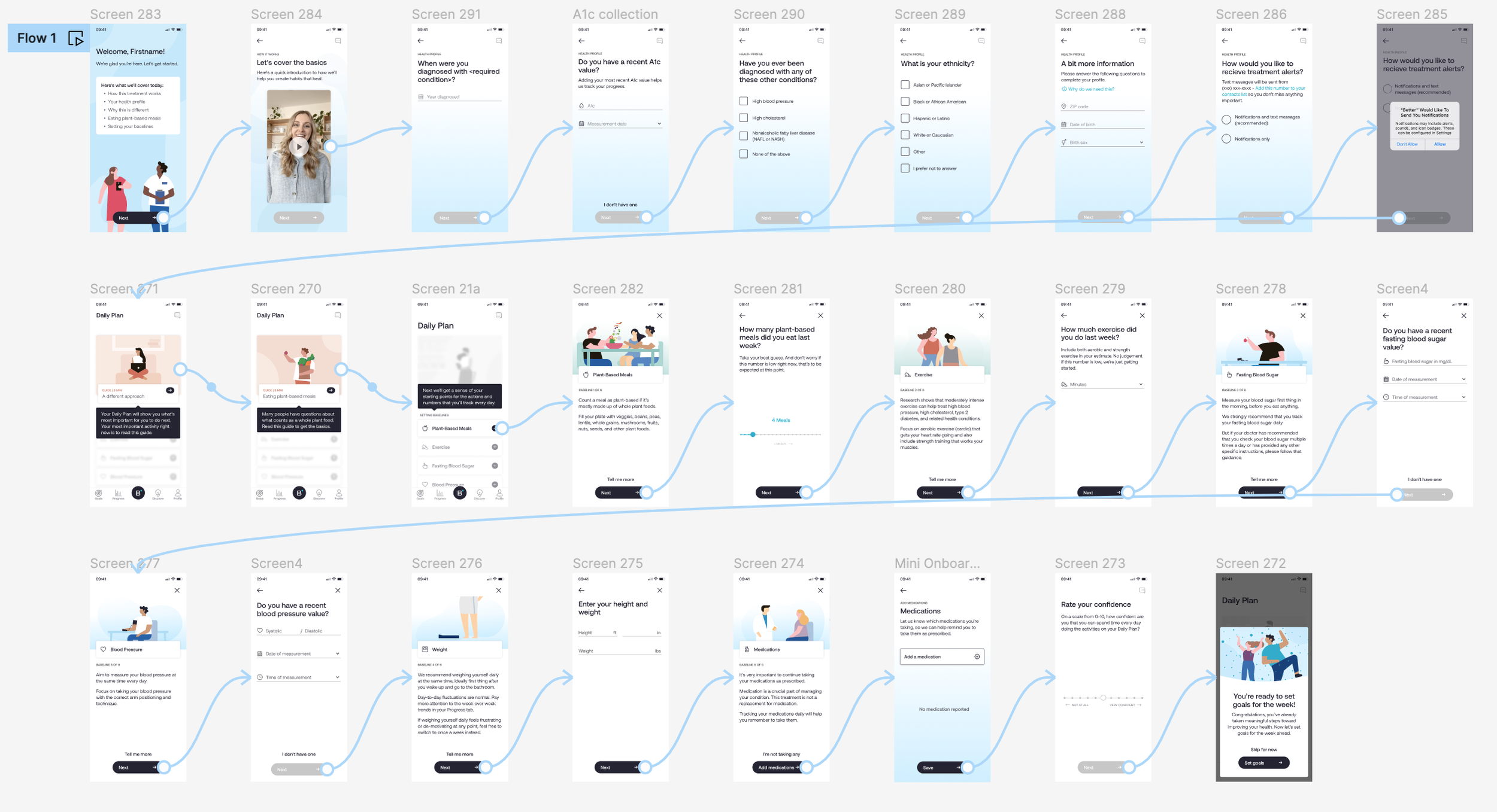
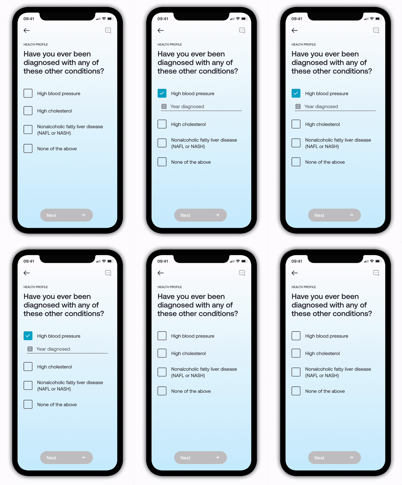
This is one example of a section within onboarding where we were able to significantly reduce the number of screens and taps and ultimately provide a more seamless experience. This simple change (reducing between 1-3 screens, depending on the user’s health condition) reduced cognitive load. However, it proved to be a sizable engineering lift, as the details collected on screens like this were critical for our FDA authorization and were tied to interactions throughout the app.
Ultimately, this decision lead to a 28% overall reduction in flow length and a faster onboarding with higher retention.
2
Explain more with fewer words
My testing pointed to the opportunity to spread videos throughout the flow to reduce written content and fill in gaps. We also wanted our product to have a warm, inviting, human connection in line with Better’s brand. I led production of four new, live action videos for our onboarding flow—a cost-effective and on-brand solution to achieve our goals.
Despite this falling outside my usual scope of work, I advised on the script, art-directed the shoots and managed the timeline, stakeholder feedback and relationship with our outside videographer to film and edit. I coached our video talent (my co-worker and our Lead of Population Health), to provide a natural, inviting delivery of detailed clinical content. I even starred as a hand model.
I also designed a net-new video player feature optimized to play a full-screen vertical video. The result was a polished look and seamless viewing experience, across all device sizes.
3
Show, don’t tell
After many, many interviews, it became clear that onboarding was teaching users to track their health data above all other actions. While this was important, it was more important (critical, actually) for users to complete the lessons, skills and guides that made up our groundbreaking therapeutic.
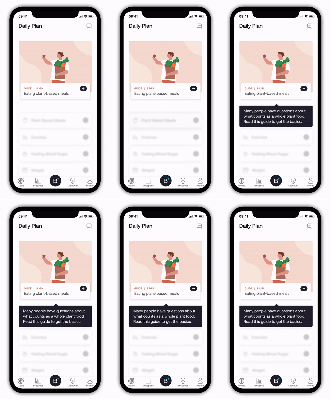
To show, rather than tell, users how to better use the product, I improved the cues to users around taking actions and interacting with product features. We refined the language in the new videos, while directly pointing users to interact early with specific cards in the UI, to guide them into the experience. This naturally taught users how to use our product, without making it feel like a tutorial.
Results
↓ 28%
Onboarding flow length
Measured in required viewing screens
↓ 5 min
Average in-app time to complete onboarding
Versus original flow time
↓ 41%
Support tickets related to onboarding confusion
↓ 2.3 days
Fewer days to complete onboarding
Of users who took more than 1 day to complete
These design updates—along with other supporting improvements in the product—made critical improvements to the user’s understanding of the therapy and how to be successful in treatment.
Measuring patient “readiness”
To better predict users’ ability to complete therapeutic activities, we asked patients: “On a scale from 0-10, how confident are you that you can spend time every day doing the activities on your Daily Plan?”
In our initial baseline collection, we saw 63% of patients rate themselves as 7 or higher. We expect this number to decrease as the N grows. Through clearer, more direct language about the treatment and its commitments, we hope and intend for more users to opt-out at the onboarding stage, as opposed to pushing through and being unsuccessful in treatment.
